The best trade show booth design ideas for logistics companies make freight visible: tall graphics with short copy, a physical prop, layered lighting and an open front. Choose them by budget, floor space and organiser rules.
This list suits exhibitors selling services rather than products. For the wider process, from choosing a show to measuring results, see how to exhibit at a trade show.
How the ideas are ordered
The ideas below are not ranked, because the supplied evidence does not show that any one beats another. They follow a visitor’s path from the aisle to the conversation. Four criteria decide which ideas to adopt.
- Visibility from a distance. Visitors decide in seconds whether a booth deserves their attention, so the first impression has to work from the aisle.
- Message clarity. A logistics service is intangible, so the booth has to show what the company moves, not only name it.
- Conversation space. The layout should let staff talk with visitors without blocking the aisle.
- Cost and reuse. The budget has to cover more than the stand itself, and reusable parts spread that cost across events.
A professionally designed booth also builds trust and curiosity immediately. That makes the first impression worth planning before anything else.
Ideas that win attention from the aisle
Tall graphic panels
Tall panels suit a booth with limited floor space. VA361’s booth guide advises prioritising vertical elements, such as tall panels with graphics, to maximise visibility. For a logistics exhibitor, a backwall photograph of a port, a warehouse aisle or a loaded trailer says more in a glance than a list of services. Check the organiser’s height and set-up restrictions in the exhibitor manual before ordering, because the permitted height at an exhibition venue can differ between shows.
Bold contrast and short copy
Graphics carry the most weight when they are simple. Instent recommends bold, contrasting colours and striking visuals to stand out. How much text should booth graphics carry? As little as the message allows: a headline, a short supporting line and the company name. Letters should be large and clear so the message is legible from different distances. The same guide warns that too many visual elements can confuse the visitor.
In practice, give each panel a single job. One panel can state the service, another can show a route or cargo type, and the counter can carry the contact details. If a graphic needs a paragraph to explain it, move that content to a handout or a screen.
Layered lighting
Lighting is easy to overlook and affects how the whole booth reads. VA361 suggests designing layers of lighting: general light for the entire booth, focal light for specific products, and effect lighting for atmosphere. For a logistics booth, the focal layer is best used on the physical prop or the key graphic, so the eye lands on the freight story first.
Ideas that make freight and supply chains visible
A scale prop as the centrepiece
A model truck, a container replica or a pallet stacked with branded cartons gives visitors something tangible to look at. This idea works because freight forwarding, customs brokerage and warehousing are hard to photograph as services. A prop turns them into an object that visitors can walk up to and ask about. It suits exhibitors with space for a display piece and a way to transport it. It suits cramped booths less well, where a prop can crowd the aisle frontage.
A screen or video wall for the route story
Instent lists a digital screen or video wall as a way to add visual impact. For a logistics company, a looping map of trade lanes or a short clip of cargo moving through a terminal shows the supply chain in motion. The screen suits exhibitors with several services to show, but it is a poor fit if the content is text-heavy, since the same legibility rules apply as for printed graphics.
Layout, meetings and lead capture
An open front and clear paths
How should the layout be planned for traffic and meetings? Start with the aisle frontage. VA361 advises designing clear paths to avoid crowds and ease access, and Instent adds that minimising clutter creates a seamless flow. Keep tall furniture and props to the sides or rear, so visitors can see in from the aisle and step in without squeezing past a counter.

A meeting zone with a break point
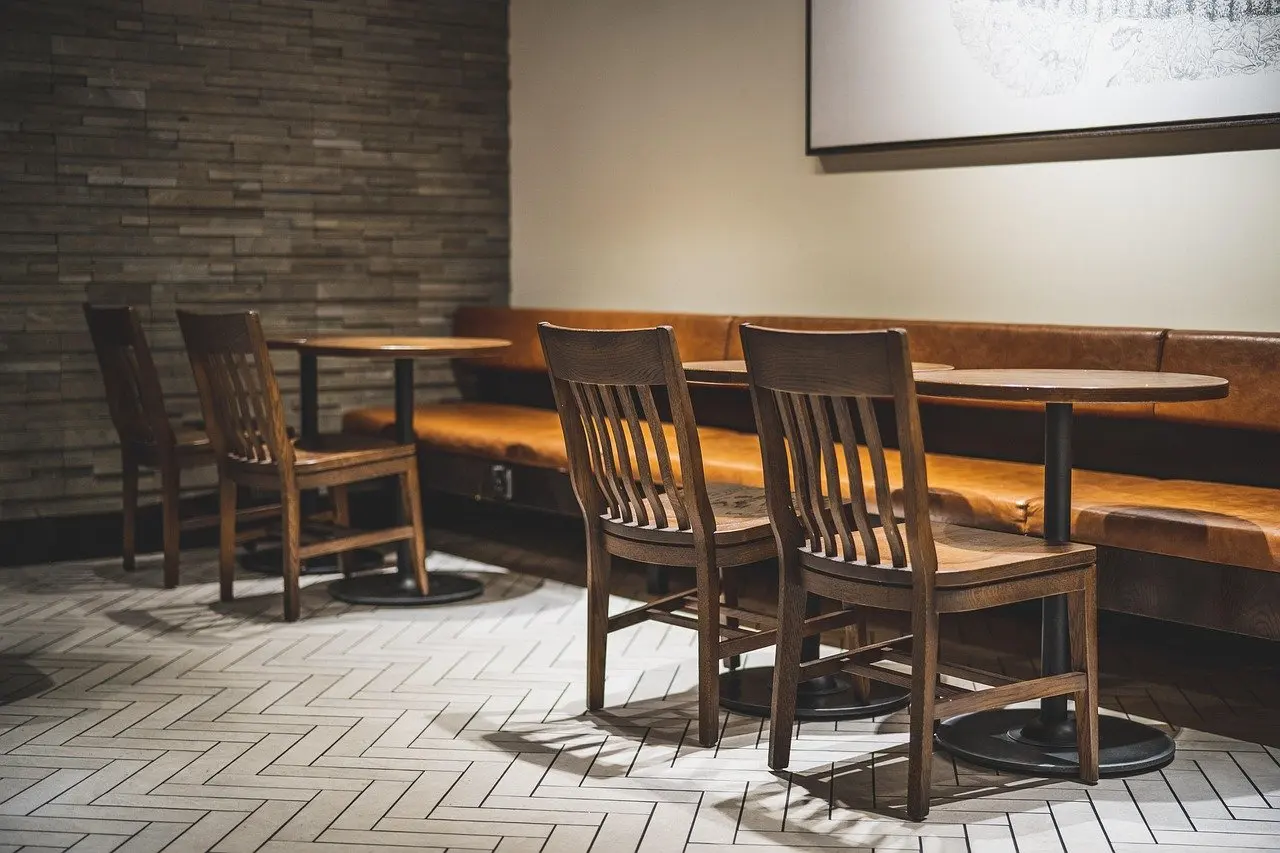
Logistics sales tend to involve longer conversations about routes, volumes and service levels than a quick product demonstration. A small table with a few chairs at the back of the booth gives those discussions a place to happen away from the aisle. VA361 also recommends a small break area or beverage bar to encourage longer, more relaxed interactions. This suits exhibitors who expect scheduled appointments. It is less useful for a small booth that mainly hands out brochures, where seating takes floor space that the open front needs.
A reason to share contact details
Instent suggests offering value in exchange for contact information, such as exclusive deals or premium content. A logistics exhibitor could offer a route-planning guide or a service comparison sheet in this way. The same guide stresses that staff should be well trained to represent the brand, make meaningful connections and generate leads. A guide to trade show booth staff training covers that side in more detail.
Small budgets and modular systems
Portable essentials
What can be done with a small budget? A portable stand with roll-up banners and folding tables covers the basics at low cost and travels easily. Put the best photograph and a short headline on the banner, and keep the table clear so it works as a conversation point rather than a storage shelf.
Modular display systems
A modular display system suits companies that attend several shows. VA361 describes modular stands as reusable and customisable, and ideal for companies that participate in multiple events. It also notes that aluminium is lightweight and easy to transport and assemble, which makes it well suited to modular structures. Instent likewise advises adaptable booth elements that can be rearranged for different events and layouts. The trade-off is that a modular kit is a fixed set of parts, so a large bespoke prop or a feature wall may still need to be sourced separately.
Budget scope
A budget has to include more than the stand. VA361 advises defining a budget that includes construction, transportation and set-up. For logistics exhibitors, transport costs are easy to underestimate when a prop or heavy display has to travel to the venue.
Comparison of the ideas
| Idea | Best for | Main limit | Planning use |
|---|---|---|---|
| Tall graphic panels | Limited floor space | Organiser height restrictions | Check the exhibitor manual before ordering artwork |
| Bold contrast and short copy | Attracting attention from the aisle | Too many visual elements confuse visitors | Keep a single message per panel and use large letters |
| Layered lighting | Directing the eye to a key display | Needs a plan for general, focal and effect light | Aim focal light at the prop or main graphic |
| Screen or video wall | Showing routes and cargo in motion | Poor for text-heavy content | Use short visual loops, not paragraphs |
| Open front and clear paths | Busy aisles | Clutter blocks the flow | Keep props and furniture to the sides or rear |
| Break area or beverage bar | Longer, relaxed conversations | Takes floor space | Add only if the booth can keep its open front |
| Roll-up banners and folding tables | Small budgets and easy transport | Less visual presence | Spend effort on one strong photograph |
| Modular aluminium system | Companies attending multiple events | Fixed set of parts | Rearrange for each show layout |
The comparison draws on guidance from VA361 and Instent, with the planning notes reflecting editorial judgement.
Final checks before the show
Set the booth up before the show if possible. VA361 notes that a pre-show set-up allows design errors to be corrected, such as a graphic that reads poorly or a prop that blocks the front. Read the organiser’s height and set-up restrictions at the same time, because they apply to the finished structure and to any overhead signage.
Once the booth is working, the design only pays off if leads are followed up. The article on trade show follow up best practices picks up from there.
Frequently asked questions
What makes a trade show booth design effective?
An effective booth earns attention in seconds, looks professional and keeps its message simple. Bold contrast, legible lettering, layered lighting and a clutter-free layout all support that, according to VA361 and Instent.
How much text should booth graphics carry?
Very little. Use large, clear letters that stay legible from different distances, and avoid piling on visual elements, which can confuse visitors.
How should I plan the layout for traffic and meetings?
Keep the front open with clear paths, minimise clutter, and place any meeting table and chairs toward the back of the booth so conversations do not block the aisle.
What can I do with a small budget?
Use roll-up banners and folding tables, invest in one strong photograph and headline, and consider reusable modular parts if you attend several events. Remember that the budget should cover construction, transport and set-up.
Do organisers limit booth height?
Organisers can set height and set-up restrictions, so check the exhibitor manual for the specific show before ordering graphics or structures.